Use the Amplify UI Authenticator component for Swift
The Amazon Cognito web hosted authentication screen is not the only option to authenticate your customers. Amazon Cognito provides low-level APIs allowing you to implement your custom authentication flows, when needed. It allows to build your own Signin, Signup, Forgot Password Views or to build your own flows. Check the available APIs in the Amplify documentation.
But building your own UI for all authentication flows is time-consuming and undifferentiated. This is why we built the Amplify UI library. Amplify UI is a collection of UI components you can reuse in your applications and customise according to your own graphic charter.
In this section, you are going to use the Amplify UI Authenticator component to provide your customers with a SwiftUI native authentication screen. The component implements signin, signup, confirm signup, forget password and other authentication-related flows.
Add the Authenticator UI library
Let’s start by adding the Authenticator UI library dependency to our project.
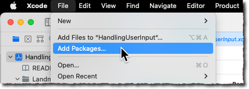
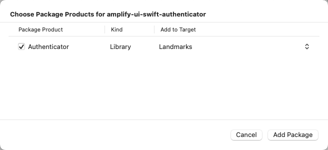
In Xcode, select File, Add Packages…
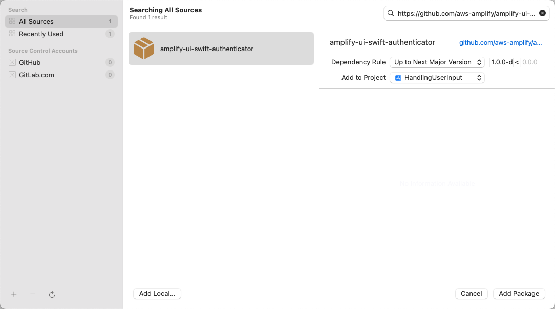
In the top right search bar, type https://github.com/aws-amplify/amplify-ui-swift-authenticator. For Dependency Rules, select Up to Next Major Version and type 1.0.0 as version. Then, select Add Package button on the bottom right.
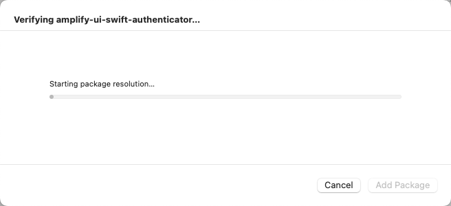
Depending on the internet bandwidth and the model of your laptop, it might take a few minutes to download and verify the Amplify UI component.
Select the Authenticator library provided by the package, then select Add Package.
Add the Amplify Authenticator Component
The Amplify UI Authenticator component wraps the views you want to place behind an authentication wall. It passes a state object that contains the current user profile, when the user is signed in. It also contains a signOut() method, allowing to you trigger the signout without exposing the Amplify package itself.
Let’s wrap our LandMarkList view with the Authenticator conponent in LandingView.swift.
Select LandingView.swift and replace its content with the following code. You can safely copy / paste the code from below:
//
//  LandingView.swift
//  Landmarks

// Landmarks/LandingView.swift

import SwiftUI
import Authenticator

struct LandingView: View {
    @ObservedObject public var user : UserData
    @EnvironmentObject private var appDelegate: AppDelegate

    var body: some View {

        Authenticator { state in
                LandmarkList().environmentObject(user)
        }
    }
}
The code is straigthforward:
- Line 8 : import the
Authenticatoramplify library - Line 16 : wrap the main view of the application (
LandmarkList) with theAuthenticatorcomponent. Thestatevariable allows the code to know about the currently authenticated user, when needed.
Build and Test
Build and launch the application to verify everything is working as expected. Click the build icon or press ⌘R.
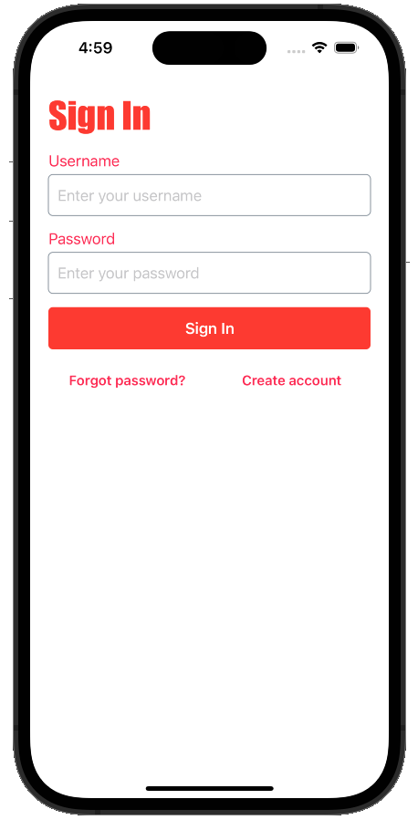
If you are still authenticated, click Sign Out and you should see this:
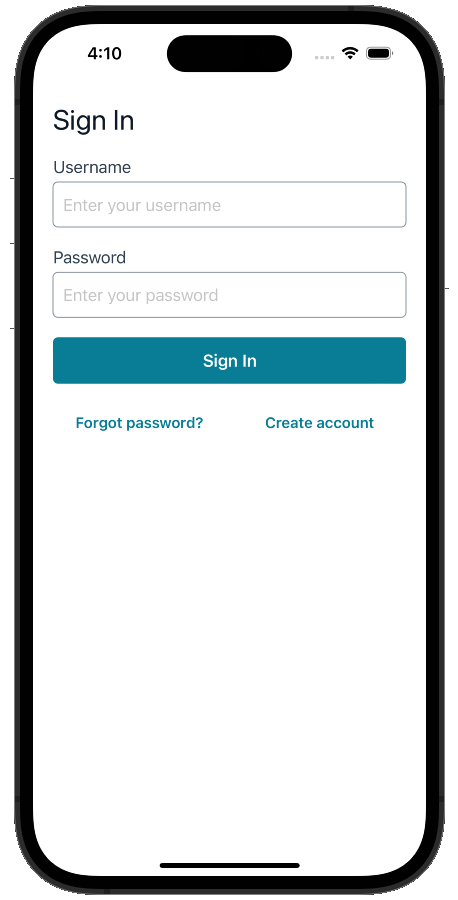
Enter the username and password that you created in section 3 and try to authenticate. After a second or two, you will see the Landmark list.
Try the Create account flow and create a second account to discover the signup flow.
Implementing Social Signin with the Authenticator component requires a bit more work on your side. When the Social Provider authentication flow completes, the Social Identity provider issues a redirect to your app. So far, the redirection was made to Amazon Cognito hosted UI and Cognito implemented the token exchange. When using a Custom View, such as the one provided by the Authenticator component, you need to handle these details in your code. The easiest is probably to use the Social Provider platform specific SDK (the Authentication Service framework in the case of Sign in with Apple) and use the Cognito SDK federatedSignIn() method. I am proposing this as an exercise for the more advanced readers.
Customize the Authenticator component
The Amplify Authenticator UI component for Swift can be heavily customised to match your application design charter.
You can decide to show or hide the sign up button and decide wich fields are proposed during the sign up flow. Check the Authenticator component documentation to learn more.
You can use themes for simple UI customization, you can provide internationalized strings to accomodate multiple languages, or add headers and footers to all views. For deeper customizations, you may provide your own views to replace the ones proposed by default, making the Authenticator component fully customisable.
As a last exercise, you may want to customise the Authenticator UI theme to change the colors and fonts. Here is the code I use in LandingView.swift:
//
//  LandingView.swift
//  Landmarks

// Landmarks/LandingView.swift

import SwiftUI
import Authenticator

struct LandingView: View {
    @ObservedObject public var user : UserData

    private let theme = AuthenticatorTheme()

    var body: some View {

        Authenticator { state in
                LandmarkList().environmentObject(user)
        }
        .authenticatorTheme(theme)
        .onAppear {
            theme.fonts.title = .custom("Impact", size: 40)
            theme.components.authenticator.spacing.vertical = 15
            theme.colors.background.interactive = .red
            theme.colors.foreground.primary = .red
            theme.colors.foreground.secondary = .pink
            theme.colors.foreground.interactive = .pink
        }
    }
}
Build and launch the application to verify everything is working as expected. Click the build icon or press ⌘R.
You should see the new look of the Authenticator component.